

1. How to Set Up Your React App
In the previous post, we explored the core concepts behind React — from components and props to state and hooks. Now it’s time to put that knowledge into action by building a practical React application: a simple but fully functional Todo List. This project will help reinforce the foundational ideas we covered and introduce you to the development process in a real React workflow. We’ll also learn how to deploy the app using Netlify so you can share your work online.
Before we start writing code, let’s walk through the basic structure of the project. This section gives you an overview of the files and setup so you can follow along and build a functional todo app from scratch.
Project Structure
Before diving into the code, here’s a quick overview of the key files in this project and their roles:
- App.js: The main root component. It holds the todo state and provides it to the rest of the app via React Context.
- ToDoList.js: Renders the list of todo items and handles the input for adding new todos.
- ToDo.js: Represents a single todo item. It includes functionality for marking a todo as completed, editing it, or deleting it.
- TodosContext.js: Defines a context to manage global todo state without having to pass props deeply — solving the common issue of props drilling.
- mystyle.css: Contains all the styling for the app. We use plain CSS to keep the styles clean and readable.
Starting with a Clean React Environment
If you’re starting from scratch, you can create a new React app with:
npx create-react-app react-todo-app
cd react-todo-app
Then remove the boilerplate files inside /src and add the files we just listed above.
You’ll also need to install the uuid library, which we’ll use to generate unique IDs for todos:
npm install uuidAdditional Tools Used
We also use a few icons from Material UI Icons to enhance the UI. This saves us time from creating or importing custom icons manually.
To install them, you can run:
npm install @mui/icons-material @mui/material @emotion/react @emotion/styled
We’ll use icons like delete (DeleteIcon) and edit (EditNoteIcon) to make the todo actions more intuitive.
💡 This tutorial keeps dependencies minimal — no routing or external state management libraries like Redux. React’s built-in hooks (
useState,useContext,useEffect) are enough for a clean, well-structured todo app.⚠️ Styling is not the main focus here, so we won’t dive deep into CSS. All styles are ready in
mystyle.cssto keep the interface clean and responsive.
2. How to Build the Components
In any React project, breaking the UI into reusable components is a key practice. It helps separate logic, improve readability, and makes debugging and future enhancements easier.
To keep things clean and modular, we’ll break down the Todo app into a few key components. Each one handles a specific part of the UI or logic. Here’s a quick overview of what we’ve built and what each component does.
Component Structure
Here’s how our component structure looks:
src/
├── components/
│   ├── TodoList.js         // Renders the list of todos
│   ├── Todo.js             // Represents a single todo item
├── context/
│   └── TodosContext.js     // React Context for global todo state
├── App.js                  // Main component, ties everything together
├── mystyle.css             // App styles
Each component focuses on doing one thing well, making the codebase easier to maintain and expand.
Let’s briefly walk through the core components:
2.1 App.js – The Root of the App
2.1 App.js – The Root of the AppThis is the entry point of your React application. Here’s what it’s doing:
This structure helps separate concerns: your context handles logic and state, while components focus on display and interaction.
TodosProvider: Wraps your app in context so that any component (likeToDoList) can access and update the global todo state.ToDoList: The main UI where users interact with their tasks.
import React from "react";
import ToDoList from "./components/ToDoList";
import { TodosProvider } from "./Contexts/TodosContext";

function App() {
  return (
    <TodosProvider>
      <ToDoList />
    </TodosProvider>
  );
}

export default App;
2.2 TodoList.js
2.2 TodoList.jsThis component:
- Save todos to
localStoragewhenever the list changes - Gets the todos from context
- Loops over them using
.map()and renders each one via theTodocomponent - Handles filtering based on user-selected status (All, Completed, Uncompleted)
- Uses
useEffectto: Load saved todos fromlocalStorageon initial mount
To keep this post concise and beginner-friendly, the code snippets below are simplified versions of what you’ll find in the full project. They’re designed to highlight the core ideas without overwhelming you with extra details or styling logic.
If you’d like to explore the full source code with all the implementation details, feel free to check out the project on GitHub:
👉 React Todo App on GitHub
import { useContext, useState, useEffect } from "react";
import { TodosContext } from "../Contexts/TodosContext";
import { v4 as uuidv4 } from "uuid";
import ToDo from "./ToDo";
export default function ToDoList() {
const { Todos, setTodos } = useContext(TodosContext);
const [title, setTitle] = useState("");
const [details, setDetails] = useState("");
const [filter, setFilter] = useState("All");
useEffect(() => {
const stored = JSON.parse(localStorage.getItem("Todos")) ?? [];
setTodos(stored);
}, []);
const handleAdd = () => {
const newTodo = {
id: uuidv4(),
title,
details,
isCompleted: false,
};
const updated = [newTodo, ...Todos];
setTodos(updated);
localStorage.setItem("Todos", JSON.stringify(updated));
setTitle("");
setDetails("");
};
const filteredTodos = Todos.filter((todo) => {
if (filter === "Completed") return todo.isCompleted;
if (filter === "UnCompleted") return !todo.isCompleted;
return true;
});
return (
<div>
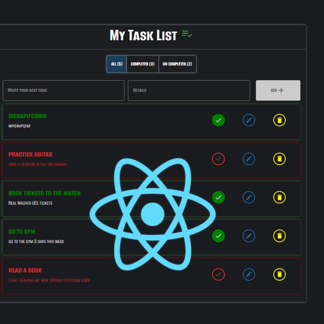
<h2>My Task List</h2>
<div>
<button onClick={() => setFilter("All")}>All</button>
<button onClick={() => setFilter("Completed")}>Completed</button>
<button onClick={() => setFilter("UnCompleted")}>Uncompleted</button>
</div>
<input
type="text"
placeholder="Task title"
value={title}
onChange={(e) => setTitle(e.target.value)}
/>
<input
type="text"
placeholder="Details"
value={details}
onChange={(e) => setDetails(e.target.value)}
/>
<button
onClick={handleAdd}
disabled={title.length === 0 || details.length === 0}
>
Add Task
</button>
<div>
{filteredTodos.map((todo) => (
<ToDo key={todo.id} todo={todo} />
))}
</div>
</div>
);
}2.3 Todo.js
2.3 Todo.jsWhat the ToDo.js Component Does??
The ToDo.js component represents a single todo item within our application. It is responsible for displaying the todo’s title and details, along with buttons that allow users to:
- Mark the todo as completed or not completed
- Edit the todo’s title and details
- Delete the todo
The component uses React’s useContext hook to access the shared todo list and its updater function, allowing it to modify the global state when todos are updated or removed.
User interactions like clicking buttons or typing in input fields trigger event handlers that update the local state or global todo list accordingly. Modals are used to confirm delete actions and edit todos in a user-friendly way.
This modular approach keeps the UI clean and logic encapsulated per todo item, enabling easier maintenance and scalability.
Here’s a quick view of the component hierarchy:
App
└── ToDoList
    └── ToDo (repeated for each item)
// Import React, hooks, and context
import React, { useContext, useState } from "react";

// Import Material UI components (Card, Dialog, Buttons, Grid, etc.)
import {
  Card,
  CardContent,
  Typography,
  IconButton,
} from "@mui/material";

// Import Material UI icons used for Delete, Check, and Edit actions
import { Delete as DeleteIcon, Check as CheckIcon, Edit as EditIcon } from "@mui/icons-material";

import { TodosContext } from "../Contexts/TodosContext";

export default function ToDo({ todo }) {
  const { Todos, setTodos } = useContext(TodosContext);

  const [openDeleteModal, setopenDeleteModal] = useState(false);
  const [openUpdateModal, setopenUpdateModal] = useState(false);

  const [UpdatedTodo, setUpdatedTodo] = useState({
    title: todo.title,
    details: todo.details,
  });

  // Toggles the completed state of this todo
  function handelcheckClick() {
    // Update the 'isCompleted' flag for this todo in the Todos array and sync with localStorage
  }

  // Open delete confirmation modal
  function handelDeleteClick() {
    setopenDeleteModal(true);
  }

  // Open update/edit modal
  function handelUpdateClick() {
    setopenUpdateModal(true);
  }

  // Confirm and delete the todo from the list
  function handelDeleteConfirm() {
    // Remove this todo from Todos array and update localStorage
  }

  // Confirm and update the todo's title and details
  function handelUpdateConfirm() {
    // Update this todo with new title and details in Todos array and update localStorage
    setopenUpdateModal(false);
  }

  const handleDeleteClose = () => setopenDeleteModal(false);
  const handleUpdateClose = () => setopenUpdateModal(false);

  return (
    <>
      <Card
        className={todo.isCompleted ? "todoCardGreen" : "todoCardRed"}>
        <CardContent>
          <Grid container spacing={2}>
            <Grid size={8}>
              <Typography
                variant="h5"
                sx={{
                  textAlign: "left",
                  color: todo.isCompleted ? "#008000" : "#d32f2f",
                }}
              >
                {todo.title}
              </Typography>
              <Typography>
                {todo.details}
              </Typography>
            </Grid>

            <Grid size={4} display="flex" justifyContent="space-around" alignItems="center">
              <IconButton
                size="small"
                onClick={handelcheckClick} // Toggles completion status of the todo
                className={todo.isCompleted ? "iconButtonChcekGreen" : "iconButtonChcekRed"}
                style={{
                  color: todo.isCompleted ? "white" : "#d32f2f",
                  background: todo.isCompleted ? "#008000" : "#191b1f",
                  border: todo.isCompleted ? "solid #008000 3px" : "solid #d32f2f 3px",
                }}
              >
                <CheckIcon fontSize="small" />
              </IconButton>

              <IconButton
                size="small"
                aria-label="edit"
                className="iconButtonEdit"
                onClick={handelUpdateClick} // Opens the update/edit modal dialog
              >
                <EditIcon fontSize="small" />
              </IconButton>

              <IconButton
                size="small"
                aria-label="delete"
                className="iconButtonDelete"
                onClick={handelDeleteClick} // Opens the delete confirmation modal dialog
              >
                <DeleteIcon fontSize="small" />
              </IconButton>
            </Grid>
          </Grid>
        </CardContent>
      </Card>

      {/* Delete Confirmation Modal */}
      <Dialog
        open={openDeleteModal}
        slots={{ transition: Transition }}
        keepMounted
        onClose={handleDeleteClose}
        aria-describedby="alert-dialog-slide-description"
      >
        <DialogTitle>Are You Sure you want to Delete This Task?</DialogTitle>
        <DialogContent>
          <DialogContentText id="alert-dialog-slide-description">
            This action cannot be undone.
          </DialogContentText>
        </DialogContent>
        <DialogActions>
<Button onClick={handleDeleteClose}>Cancel</Button> {/* Closes the delete confirmation modal */}
<Button onClick={handelDeleteConfirm}>Yes, Delete</Button> {/* Confirms and deletes the todo */}
        </DialogActions>
      </Dialog>

      {/* Update Todo Modal */}
      <Dialog
        open={openUpdateModal}
        slots={{ transition: Transition }}
        keepMounted
        onClose={handleUpdateClose}
        aria-describedby="alert-dialog-slide-description"
      >
        <DialogTitle>Update Task Title and Details</DialogTitle>
        <DialogContent>
          <TextField
            value={UpdatedTodo.title}
            onChange={(e) => setUpdatedTodo({ ...UpdatedTodo, title: e.target.value })} // Updates title in state during editing
          />
          <TextField
            value={UpdatedTodo.details}
            onChange={(e) => setUpdatedTodo({ ...UpdatedTodo, details: e.target.value })} // Updates details in state during editing
          />
        </DialogContent>
        <DialogActions>
<Button onClick={handleUpdateClose}>Cancel</Button> {/* Closes the update modal */}
<Button onClick={handelUpdateConfirm}>Update</Button> {/* Confirms and updates the todo */}
        </DialogActions>
      </Dialog>
    </>
  );
}
3. Putting it All Together: State Sharing with Context
As your React app grows, you often need to share state between multiple components. One common challenge is props drilling — passing data down through many levels of components, even if some of them don’t directly need the data.
For example, without context, we’d have to pass our todos from App.js → ToDoList.js → ToDo.js, and any update function too. This quickly becomes hard to maintain.
Solution: React Context
React’s useContext hook, combined with the createContext API, gives us a clean solution. By wrapping our component tree in a context provider (in App.js), any nested component can access or modify the shared state directly — no need to pass props manually through each level.
Here’s how we use it:
- In
TodosContext.
import { createContext } from "react"; export const TodosContext = createContext([]);- In
App.js, we wrap our components in the provider and manage the shared state:
<TodosContext.Provider value={{ todos, setTodos }}>
{/* child components */}
</TodosContext.Provider>- Then inside any child component (like
ToDoList.jsorToDo.js), we can easily access the todos:
const { todos, setTodos } = useContext(TodosContext);This makes our code cleaner, avoids repetition, and keeps state management centralized.
4. Building the Functionality: How to Add Todos
Now that we’ve set up our components and shared state using context, let’s look at how we allow users to add new todos into the app.
This section covers:
- Creating a new todo object
- Using
uuidv4to generate a unique ID - Updating global state with the new todo
- Clearing the input field after submission
The Concept
Whenever a user types in the todo title and details, we want to:
- Track the input using
useState - Create a new todo object with required fields
- Update the global list by adding it to context
- Reset the input so the user can enter another todo
What a Todo Looks Like
Each todo item we store follows this shape:
{
  id: 'unique-id',
  title: 'Buy groceries',
  details: 'Milk, Eggs, Bread',
  isCompleted: false
}
input Fields for Todo Title and Details
We have two controlled input fields where users enter the title and details for their new todo:
<DarkTextField
  label="Write your next task"
  value={TitleInput}
  onChange={(e) => SetTitleInput(e.target.value)}
/>
<DarkTextField
  label="Details"
  value={DetailsInput}
  onChange={(e) => SetDetailsInput(e.target.value)}
/>
We use React’s useState hook to keep track of the input values in TitleInput and DetailsInput.
Creating a New Todo Object
When the user clicks the Add button, the HandleAddClick function triggers:
function HandleAddClick() {
  const newTodo = {
    id: uuidv4(),
    title: TitleInput,
    details: DetailsInput,
    isCompleted: false,
  };
  const updatedtodos = [newTodo, ...Todos];
  setTodos(updatedtodos);
  SetTitleInput("");
  SetDetailsInput("");
  localStorage.setItem("Todos", JSON.stringify(updatedtodos));
}
Key points here:
- We generate a unique ID for the new todo using the
uuidv4()function. - The new todo object includes the title, details, and an
isCompletedflag set tofalse. - We prepend the new todo to the existing
Todosarray, then update the global state usingsetTodos. - Inputs are reset to empty strings after adding.
- The updated list is saved to
localStorageto ensure persistence.
Updating Context State
We use setTodos([...todos, newTodo]) to update the array in-place. Because we’re using context, this update reflects immediately in every component that consumes TodosContext.
Add Button Enable/Disable Logic
The Add button is disabled if either the title or details input is empty:
disabled={TitleInput.length === 0 || DetailsInput.length === 0}This prevents users from adding empty todos and improves user experience.
5. Filtering Todos by Completion Status
A useful feature in any todo app is the ability to filter tasks based on their completion status — showing all tasks, only completed ones, or just the ones still pending.
In our app, this is handled using Material-UI’s ToggleButtonGroup with three options: All, Completed, and Uncompleted. The currently selected filter is managed with React’s useState hook through the DisplayedTodoType state.
const [DisplayedTodoType, setDisplayedTodoType] = useState("All");Filtering Logic
Depending on DisplayedTodoType, we create filtered arrays:
const CompletedTodos = Todos.filter(t => t.isCompleted);
const UnCompletedTodos = Todos.filter(t => !t.isCompleted);

let TodosAfterFiltering = Todos;
if (DisplayedTodoType === "Completed") {
  TodosAfterFiltering = CompletedTodos;
} else if (DisplayedTodoType === "UnCompleted") {
  TodosAfterFiltering = UnCompletedTodos;
}
This way, the app dynamically shows todos matching the selected filter.
Toggle Buttons to Change Filters
We use Material-UI’s ToggleButtonGroup and custom-styled ToggleButtons for the user to switch filters:
<ToggleButtonGroup
  value={DisplayedTodoType}
  exclusive
  onChange={(e) => setDisplayedTodoType(e.target.value)}
  aria-label="todo filter"
>
  <ToggleButtonAll value="All">All ({Todos.length})</ToggleButtonAll>
  <ToggleButtonCompleted value="Completed">Completed ({CompletedTodos.length})
  </ToggleButtonCompleted>
  <ToggleButtonUncompleted value="UnCompleted">Un-Completed ({UnCompletedTodos.length})
  </ToggleButtonUncompleted>
</ToggleButtonGroup>
Rendering Filtered Todos
Finally, we map the filtered todos to render each item:
const AllTodos = TodosAfterFiltering.map(t => <ToDo key={t.id} todo={t} />);Don’t worry if you aren’t familiar with Material-UI components like ToggleButtonGroup or ToggleButton. You can think of them as regular HTML buttons or inputs that control which todos are shown.
This filtering allows users to seamlessly switch views, making it easier to focus on pending tasks or review completed ones.
6. Persisting Data with localStorage and React’s useEffect Hook
One important feature of any task management app is data persistence — users expect their tasks to stay available even after refreshing the page or closing the browser. Since this project doesn’t use a backend or database, I used the browser’s built-in localStorage to keep things simple.
Why localStorage?
localStorage allows us to store key-value pairs in the browser, and the data stays there even after a page reload or browser restart — until it’s manually cleared. It’s perfect for small projects where you want to keep user data without needing a server.
How we used it
Every time the todos are updated, whether through adding, editing, deleting, or toggling completion, I save the updated list in localStorage like this:
localStorage.setItem("Todos", JSON.stringify(updatedTodos));The JSON.stringify() method is used to convert the JavaScript array of todos into a string format that can be stored in localStorage.Then, when the app initially loads, I retrieve the saved todos (if any) using:
const storedTodos = JSON.parse(localStorage.getItem("Todos")The Challenge: Loading Initial Data(React useEffect)
But how do we load the saved todos from localStorage when the app starts? This is where React’s useEffect hook plays a vital role.
We need to load saved todos when the app starts, but only once during initial load. Without proper timing, we might:
- Trigger unnecessary storage reads
- Create infinite re-render loops
- Overwrite valid state with stale data
What is useEffect?
useEffect lets you run side effects in your components. These are operations that interact with the outside world or React’s lifecycle, such as:
- Fetching data from an API
- Updating the DOM
- Setting up subscriptions or timers
- Reading from or writing to
localStorage
Basic Syntax
useEffect(() => {
  // Side effect logic here
}, [dependencies]);
- The first argument is a function that contains the side-effect logic.
- The second argument (the dependency array) tells React when to run the effect.
In Our App
We used useEffect to load todos from localStorage once, when the app mounts:
useEffect(() => {
  const storedTodos = JSON.parse(localStorage.getItem("Todos"));
  if (storedTodos) {
    setTodos(storedTodos);
  }
}, []);
Here’s what’s happening:
- The empty dependency array
[]tells React: “Run this function only once, when the component first mounts.” - We check
localStoragefor stored todos. - If they exist, we load them into state using
setTodos.
⚠️ Without this
useEffect, the app would always start with an empty list — even if there were todos saved in the browser.
If you’re new to localStorage, it only works for small-scale data and is accessible only on the client side. For larger apps or real-world production systems, you’d typically use a backend service or database instead.
React’s useEffect hook is one of the most essential concepts to grasp when working with functional components. In this app, we used it to load todo items from localStorage when the app starts — but its use cases go far beyond that.
7. Handling Todo Actions: Complete, Edit, Delete”
Our app provides full control over each todo, including completing, updating, and deleting tasks. These interactions are handled within the ToDo component. One of the advantages of using React’s useContext is the ease of accessing and updating shared state — in our case, the list of todos — without prop drilling. In the ToDo component, we directly consume the TodosContext to access and modify todos, including completing, updating, and deleting individual tasks.
const { Todos, setTodos } = useContext(TodosContext);
With this setup, we can focus entirely on interaction logic without worrying about passing data from parent components.
6.1 Marking a Todo as Complete or Incomplete
When a user clicks the check icon, we toggle the isCompleted status of the corresponding todo. The UI reflects this change with color and text style:
function handelcheckClick() {
  const UpdatedTodos = Todos.map((t) => {
    if (t.id == todo.id) {
      t.isCompleted = !t.isCompleted;
    }
    return t;
  });
  setTodos(UpdatedTodos);
  localStorage.setItem("Todos", JSON.stringify(UpdatedTodos));
}
<IconButton
onClick={handelcheckClick}
className={
todo.isCompleted ? "iconButtonChcekGreen" : "iconButtonChcekRed"
}
style={{
color: todo.isCompleted ? "white" : "#d32f2f",
background: todo.isCompleted ? "#008000" : "#191b1f",
border: todo.isCompleted
? "solid #008000 3px"
: "solid #d32f2f 3px",
}}
>
<CheckIcon fontSize="small" />
</IconButton>6.2 Editing a Todo
Clicking the edit icon opens a modal dialog where users can update the todo’s title and details. These fields are controlled using the UpdatedTodo state:
const [UpdatedTodo, setUpdatedTodo] = useState({
  title: todo.title,
  details: todo.details,
});
function handelUpdateConfirm() {
const updatedtodos = Todos.map((t) => {
if (t.id == todo.id) {
return {
...t,
title: UpdatedTodo.title,
details: UpdatedTodo.details,
};
} else {
return t;
}
});
setTodos(updatedtodos);
localStorage.setItem("Todos", JSON.stringify(updatedtodos));
setopenUpdateModal(false);
}Edit<TextField
label="Task Title"
value={UpdatedTodo.title}
onChange={(e) =>
setUpdatedTodo({ ...UpdatedTodo, title: e.target.value })
}
/>
<TextField
label="Task Details"
value={UpdatedTodo.details}
onChange={(e) =>
setUpdatedTodo({ ...UpdatedTodo, details: e.target.value })
}
/>6.3 Deleting a Todo
A confirmation dialog appears when clicking the yellow delete icon. Once confirmed, the todo is removed from both state and local storage:
function handelDeleteConfirm() {
  const UpdatedTodos = Todos.filter((t) => t.id !== todo.id);
  setTodos(UpdatedTodos);
  localStorage.setItem("Todos", JSON.stringify(UpdatedTodos));
}
By centralizing state management with context, we avoid the complexity of prop drilling and gain cleaner, more maintainable code — especially when working with multiple nested components.
Conclusion
Congratulations! You’ve successfully built a complete Todo App using React and Material UI — from setting up the project structure, managing state with React Context, to handling user interactions and persisting data with localStorage.
This app is more than just a checklist; it’s a practical example of how React concepts come together in a real-world project. You’ve gained hands-on experience with:
- Managing component state using
useStateanduseEffect - Sharing data across components with React Context
- Building reusable UI with Material UI components
- Handling user events like adding, updating, completing, and deleting tasks
- Keeping data persistent between sessions using
localStorage - Creating clean, accessible modals for confirmations and updates
Through this post, we’ve explored the main ideas and key sections of the code that make the app functional and user-friendly.
While this overview focused on the most important parts of the implementation, the full project contains additional details and features worth exploring. Feel free to clone, explore, and modify the source code to deepen your understanding and add your own features.
📂 Check out the full project on GitHub:
https://github.com/MohamadSabha/React-Todo-App
🚀 Try the live demo on Netlify:
https://mhd-todoapp.netlify.app/
Thanks for following along! Stay tuned for more projects and tutorials.
See you in the next post!

